Stewart and Company 721 5th Avenue. Wurts Bros. Photo. Image from the Museum of the City of New York.
Stewart and Company
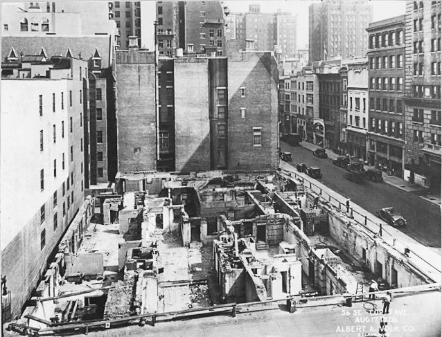
Timing in business is everything and Stewart and Company did not have good timing. By the late 1920’s Manhattan’s new fashionable shopping district centered around 57th Street. In 1928 Stewart and Company decided to move their store up 5th Avenue from their 37th Street location. The northeast corner of 5th Avenue and 56th Street seemed to be a perfect site for the new store. Stewart and Company’s new home occupied the site of five private townhouses constructed by William Waldorf Astor between 1889 and 1898. The townhouses converted to commercial properties in 1911. Construction of the new store began as soon as the site was cleared.

The demolition of the town houses at 5th Avenue & 56th Street. Image from NYPL Digital Collections.
Warren and Wetmore, the architectural firm responsible for some of the finest examples of Beaux-Arts structures in New York, including Grand Central Terminal (1913) and the Heckscher Building (1921) embraced modernism for their design of the Stewart and Company Building. The building rose to twelve stories in unbroken simplicity. The only ornamentation on the façade were the elaborate entrance and the two friezes of dancing women. At the time Stewart and Company’s opening these details drew the most criticism. Helen Appleton Read’s article “Modern Shops” in the January 18, 1930 issue of Vogue had this to say:
“Since we have become, as it were, architecturally conscious, it is small wonder that a shop demonstrating the aesthetic of modern architecture and situated in the most fashionable section of the New York shopping centre has become the talk of the town, and more than a seven days’ wonder. They make convincing demonstration of the aesthetic possibilities of functionalism. The occasional lapses from the precept, the too ornate doorway of the building and the ornaments over the lower windows, are not sufficient to mar the general effect of fine simplicity.”

Stewart and Company’s metal and ceramic 5th Avenue entrance, detail, 1929. Wurts Bros. photograph. Museum of the City of New York.

Ornamental frieze above the 8th story, 1929. Wurts Bros. photograph, Museum of the City of New York.
Walter Rendell Storey writing in The New York Times, November 3, 1929 about Stewart and Company reported:
“In the exterior of the new Stewart Building Whitney Warren has epitomized what might be termed a classic expression of metropolitan architecture. The austerity of its monolithic characteristics is challenged by the entrance decoration in green and sliver metal and golden-hued tiling, as well as by the two bas-reliefs cut in an otherwise unornamented white stone facade at the ninth story. The cubical mass feeling that is found in some of the best modern architecture is obviously achieved. Ornamental detail is reserved for the entrance and show windows. It is in these areas of decoration that the special purpose of a smart modern fashion shop of today is suggested. The whole portal is the work of Trygve Hammer, after designs by Warren & Wetmore. The bas-reliefs were carved by Rene Chambellan.”

Vogue Advertisement for Stewart and Company. October 26, 1929.
Stewart and Company broke away from the traditional department store layout. Instead of aisle after aisle of display cases the new store comprised many shops. These “shops” of course were not individually owned as in a present day mall. They were rooms or alcoves devoted to specific merchandise. The design of the shops and floors fell to several different interior design firms. Again The New York Times article by Storey gives the best description of the interior of Stewart and Company –
“As one enters the first impression is of warmth of color. Absent are the cool effects so often disclosed in the modern mode. One quickly discovers, too, that the architects who were responsible for each floor provided for the comfort of patrons as well as for convenient display of merchandise. On the ground floor, designed by J. Franklin Whitman, Jr. of Whitman & Goodman, spaciousness makes possible a variety of vistas that is distinctly alien to the old type of store arrangement. Some of the side sections of the ground floor are veritable small specialty shops themselves. Where perfumes are sold, for example, a semi-circular alcove is paneled in dark brown wood. Slender black columns are capped with a band of silver.

Stewart and Company’s Evening Salon advertisement from the November 9, 1929 Vogue.
This atmosphere of intimacy is carried out still further on the second and third floors, also designed by Mr. Whitman. On the second floor, entering the section in which women’s shoes are displayed, one is not confronted with the usual shelves stacked with boxes. Paneled walls of satinwood trimmed with metal form the background. Tall pilasters reach from the floor to the high ceiling. There are handsome metal grills. Informally placed chairs and settees in the modern style further the suggestion of a smart metropolitan club.”

Artist rending of the Stewart women’s shoe department. Vogue, November 9, 1929
The Storey article continues –
“. . . the fourth floor – which, together with the sixth, seventh and eighth floors, was planned by Eugene Schoen – one sees the color scheme soften from black and cream to gray. At the far end definite colors lure the eye. Opening off the centre space are intriguing places for the showing of sports apparel; a ‘Winter’ and a ‘Summer’ room, each with walls appropriately decorated. Appropriateness has been studied with such care that once finds dressing rooms lined with blue for blonde and with tan for the brunette.
Mr. Schoen makes much use of open show windows, placed in strategic positions. These, with their effective illumination and their exotic woods, plainly paneled, provide congenial accents – not failing, at the same time to serve as a practical vehicles for display of merchandise.
One of the most interesting of the several floors is the eighth, where bronzes, ceramics, glass and small pieces of furniture are displayed. Here the architect has created a number of small alcove shops which surround the octagonal central floor space. In the furniture designed for his settings Mr. Schoen has developed graceful chairs and sofas in African mahogany and queen’s wood. Pastel upholstery harmonizes unobtrusively with the various interiors or sections.”

Stewart and Company, the Gift Floor. Vogue Magazine advertisement, November 23, 1929.
“More luxurious is the decoration of the fifth floor by Carlu & Boyle. Here, as a setting for furs a salon in gray harewood has been installed. The smartness of sophistication hovers over the interior with its black pilasters set along the walls, its silver metal work around the doorways and its black rug. In the center portion of the floor are huge wall mirrors. Smaller salons provide various backgrounds, from an intimate one in powder blue with white bas-relief decoration, to a formal long salon where metal and glass combine with new architectural details of cornices and pilasters to produce a distinctly modern setting.”
– Walter Rendell Storey, New York Times, November 3, 1929

Eugene Schoen, Inc. advertisement for the opening of Stewart’s & Company. New York Times October 21, 1929.
The individual shop concept of Stewart’s separated it from every other store in the city. Stewart and Company was the very epitome of modern. It opened with a gala luncheon attended by notables in art and industry. The guests included Harvey Wiley Corbett, Frank Crowinshield, Whitney Warren, Grover Whalen, Raymond Hood and Eleanor Roosevelt. Unfortunately the timing could not have been worse, thirteen days after the luncheon the stock market crashed. Stewart’s, a small company had become over extended and with the onset of the depression never attained the customers it needed to survive. By the spring of 1930 Stewart and Company filed for bankruptcy and went out of business.
-

-
Stewart Millinery Shop, 1929. Image from Vogue.
-

-
The millinery shop at Stewart and Company, 1929. Image from Vogue.
Bonwit Teller

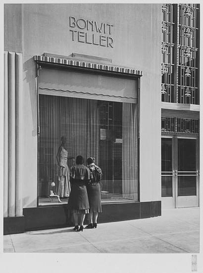
Bonwit Teller, 1930. Store window. Sigurd Fischer photograph, Museum of the City of New York.
On September 15, 1930 Bonwit Teller opened in the former Stewart Building. This marked 35 years of progress, from the opening of their first store on Sixth Avenue and 18th Street in 1895. Two more shops followed in 1896 and 1898. Consolidation of the three stores into one location at Fifth Avenue and 38th Street occurred in 1911. And like Stewart’s the year before, now Bonwit’s moved up to the new fashionable shopping district around 57th Street.

Bonwit Teller, Ely Jacques Kahn’s remodeled 5th Avenue entrance, 1930. Sigurd Fischer photograph, Museum of the City of New York.
Before moving into the Stewart Building, Bonwit’s hired one of the best architects in New York, Ely Jacques Kahn to redesign the store. The New York Times reported on September 14, 1930:
“In taking over the Stewart Building Bonwit Teller found it necessary to reconstruct the interior and to make radical external changes to fit the physical necessities of their organization. The general layout of the shop has been so changed as to achieve twice the space on the main floor obtainable under the original plan. Lighting and ventilation facilities also have been increased.
-

-
Ely Jacque Kahn’s redesign of the main floor, 1930. Photograph by Sigurd Fischer, Museum of the City of New York.
-

-
Main floor of Bonwit Teller, 5th Avenue & 56th Street. Sigurd Fischer photograph, Museum of the City of New York.
-

-
1930 Main Floor of Bonwit Teller. Photograph by Sigurd Fischer, Museum of the City of New York.
The changed front of the building presents a facade in a combination of Benedict metal and glass. The facade runs to the second floor and has a vestibule of similar treatment.”
-

-
Two story Benedict metal and glass entrance to Bonwit Teller, designed by Ely Jacques Kahn, 1930. Photograph by Sigurd Fischer, Museum of the City of New York.
-

-
Bonwit Teller 5th Avenue entrance, 1930. Sigurd Fischer photograph, Museum of the City of New York.
-

-
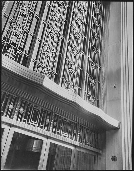
Bonwit Teller’s main entrance detail. Photograph by Sigurd Fischer, Museum of the City of New York.
The New York Herald-Tribune reporting on October 5, 1930 said this of Bonwit Teller’s new store:
“Except on the main floor the lighting arrangement consists of a suspended ceiling fixture casting an indirect light.
Of the eight floors of the building devoted to merchandise, the fourth is perhaps the most beautiful. It is finished in harewood and is soft grey in tone. This floor is devoted to the special order department, furs and a French corner in which are assembled such boudoir accessories as pillows, lamps and other things.”
-

-
Bonwit Teller, evening ware. 1930 Sigurd Fischer photograph. Image from the Museum of the City of New York.
-

-
Bonwit Teller Fur Department, 1930. Sigurd Fischer photograph, Image from the Museum of the City of New York.
-

-
Bonwit Teller 1930. Sigurd Fischer photograph. Image from The Museum of the City of New York.
-

-
Bonwit Teller 1930 interior . Sigurd Fischer photograph. Image from The Museum of the City of New York.
-

-
The re-constructed 5th Avenue entrance – Ely Jacque Kahn, 1930. Sigurd Fischer photograph, Museum of the City of New York.
-

-
Vestibule of the 5th Avenue entrance of Bonwit Teller, 1930. Sigurd Fischer photograph, Museum of the City of New York.
Bonwit Teller found the success that eluded Stewart and Company, initially. In 1934 during a period of financial difficulty Bonwit Teller partnered with Floyd Odlum, and well known financier. His Atlas Corporation acquire the store chain. This new management proved to be one of the most forward thinking and cutting edge of any department store in Manhattan. They proved this at the close of 1936 when The Museum of Modern Art presented an exhibit entitled Fantastic Art, Dada, Surrealism. Fourteen works by Salvador Dali were featured in the show. This inspired Bonwit Teller to commission Dali to design a window for the store. For the 1936 Christmas season and into 1937 5th Avenue shoppers viewed the first surrealist art ever featured in a department store showcase window. In total eight windows were presented, one based on a Dali sketch with the others drawing inspiration from it.

Bonwit Teller advertisement in the New York Herald-Tribune. December 20, 1936.

“She was a Surrealist Woman like a Figure in a Dream.” The window based on a sketch by Salvador Dali. December 1936. Worsinger Photo, Museum of the City of New York.
Below are Bonwit Teller’s art department designed surrealist windows.
-

-
Surrealist Window No. 1., 1936. Worsinger Photo, Museum of the City of New York.
-

-
Surrealist Window No. 2., 1936. Worsinger Photo, Museum of the City of New York.
-

-
Surrealist Window No. 3., 1936. Worsinger Photo, Museum of the City of New York.
-

-
Surrealist Window No. 3., 1936. Worsinger Photo, Museum of the City of New York.
-

-
Surrealist Window No. 5., 1936. Worsinger Photo, Museum of the City of New York.
-

-
Surrealist Window No. 6., 1936. Worsinger Photo, Museum of the City of New York.
-

-
Surrealist Window No. 7., 1936. Worsinger Photo, Museum of the City of New York.
In 1938 Odlum’s wife Hortense became president of Bonwit Teller. The store underwent an expansion during this period, too. In 1938 saw the addition of two floors and construction began on a twelve story 56th Street annex that opened in 1939.
-

-
Steel Framework for the Bonwit Teller’s 56th Street expansion. 1938. Wurts Bros. photograph Museum of the City of New York.
-

-
Bonwit Teller’s 56th Street expansion nearing completion. 1938-1939. Wurts Bros. photograph Museum of the City of New York.
-

-
Bonwit Teller’s 56th Street expansion completed. 1939. Wurts Bros. photograph Museum of the City of New York.

Bonwt Teller ca. 1945, around the time of its sale to the Hoving Corporation. Wurts Bros. photograph, Museum of the CIty of New York.
Through the next couple of decades Bonwit Teller remained one of the most popular department stores in Manhattan. Ownership transferred to the Hoving Corporation in 1946 and then to Genesco in 1956. Genesco a large conglomerate operated more than 60 apparel and retail companies, that included stores like Henri Bendel, but was basically a shoe retailer. With this change in ownership in the mid-1950’s Bonwit Teller’s slow decline began. Bonwit Teller had developed a cutting edge fashion reputation with such designers as Christian Dior. Now as a result of the new management they began to lose both their fashion and sales momentum.

Bonwit Teller in 1956. Photograph from Pinterest.
The decline of Bonwit Teller continued through the 1970’s. And in 1979 ownership passed to a new parent company, Allied Stores Corporation. Allied retained all the stores in the chain, except for the flagship 5th Avenue location. Judith Cummings reported in The New York Times on May 20, 1979:
“49 Years of Elegance Ends At Bonwit’s 5th Ave. Store – Bonwit Teller closed its Fifth Avenue retail operation for the last time yesterday, passing the way of the Savoy Plaza Hotel as an enduring standard of elegance on the avenue. What was left of such an era ended yesterday, amid emptied racks and tag-end reductions for last-day shoppers at the 49-year-old specialty store next to Tiffany’s. A Manhattan real-estate developer, Donald Trump, who paid $15 million for the Bonwit property, has proposed tearing the store down to erect in its place a $100 million, 60 story skyscraper, with a mix of apartments, offices and shops.”
Demolition of the building began the following March. Yet all would not be lost. According to Suzanne Daley in The New York Times, March 16, 1980:
“The bronze grill work above the main entrance and the two relief sculptures high up on the façade will be offered to the Metropolitan Museum of Art. If the donation is approved by the Board of Trustees of the museum, and if they survive the move, the developers will receive a tax deduction.”

Demolition of Bonwit Teller’s flagship store, 1980. One of the two Rene Paul Chambellan Dancing Lady bas-reliefs.
But this never happened. Robert D. McFadden in The New York Times, June 6, 1980:
“Developer Scraps Bonwit Sculptures –
Two stone bas-relief sculptures high on the façade of the Bonwit Teller Building under demolition on Fifth Avenue – pieces that had been sought with enthusiasm by the Metropolitan Museum of Art – were smashed by jackhammer yesterday on the orders of a real estate developer.
The destruction of the Art Deco panels stunned some art appraisers and elicited expressions of surprise and disappointment from officials of the Met, where they were to have been installed by the department of 20th-century art. One appraiser placed their value at several hundred thousand dollars.
Donald J. Trump, the developer, who is razing the structure to make way for a $100 million 62-story bronze-color glass tower of apartments, offices and stores, had said several months ago that he would give the white stone panels to the museum if the cost of removing them did not prove prohibitive.
But John Baron, a vice president of the Trump Organization, said after the demolition yesterday that the company had decided not to preserve the sculptures because ‘the merit of these stones was not great enough to justify the effort to save them.’
Mr. Baron said the company had got three independent appraisals of the sculptures. These, he said had found them to be ‘without artistic merit’ and worth less than $9,000 in ‘resale value.’ He said it would have cost $32,000 to remove them carefully and would have delayed demolition by a week and half.
‘How extraordinary’, said Ashton Hawkins, vice president and secretary of the board of trustees of the Met, when told of the Trump decision. ‘We are certainly very disappointed and quite surprised. Can you imagine the museum accepting them if they were not of artistic merit? Architectural sculpture of this quality is rare and would have made sense in our collections. Their monetary value was not what we were interested in.’

Destruction of the Rene Paul Chambellan bas-reliefs on June 5, 1980. New York Times photograph.
Peter M. Warner, a researcher at an architectural firm opposite the Bonwit building, had seen the panels from his 12th-floor windows for years and watched yesterday as they were destroyed. ‘I really couldn’t believe my eyes,’ said Mr. Warner, who described himself as a student of historical architecture. ‘I had read that they were probably going to the Metropolitan.’ Instead, he recalled: ‘I looked out the window and saw they had cut the left-hand panel in half horizontally and were proceeding to do the same to right-hand panel. It’s very regrettable to see the destruction of these important artifacts.”
And what happened to the huge metal grill also promised to the Metropolitan Museum of Art? It never made it to the museum. According to an article by Josh Barbanel in The New York Times, June 7, 1980:
“The real estate developer who ordered the destruction of two bas-relief sculptures that adorned the partly-demolished façade of the Bowit Teller building he does not know what has happened to a rare bronze grillwork that is no longer in the same building.
The glided 20-by-30 foot grillwork of interlocking geometric designs built into the main entrance of the Fifth Avenue building on the northeast corner of 56th Street was offered to the museum last February by the Trump Organization, along with the two Art Deco sculptures if they could be successfully ‘
The grillwork, attributed to the decorative designer, Ely Jacques Kahn, was successfully removed from the building several weeks ago, but later disappeared.
‘We don’t know what happened to it,’ said John Baron, a vice president of the Trump Organization, when asked about the grillwork.”

“Benedict nickel” grillwork, designed by Otto J. Teegen over the 5th Avenue entrance to Bonwit Teller. 1930 Wurts Bros. photograph. NYPL Digital Collection
Robert D. McFadden in another article on the destruction of the Bonwit’s building exterior art wrote in The New York Times, June 8, 1980:
“Designer Astonished by Loss of Bonwit Grillwork
A prominent architect who 50 years ago designed the huge Art Deco grillwork over the main entrance of the Bonwit Teller Building, expressed astonishment yesterday that a real estate developer had lost track of the elaborate solid nickel ornament.
The 15-foot by 25-foot grillwork, which apparently vanished from the demolition site several weeks ago, and the 15-foot sculpture panels, which were smashed by jackhammers on Thursday afternoon, had been sought by curators of the Metropolitan Museum of Art.
Asked about the grillwork, John Baron, a vice president of the Trump Organization said: ‘We don’t know what happened to it.’
Otto J. Teegen said he designed the grillwork in 1930, a year after the building was erected. When P.J. Bonwit took it over in 1930, he asked the architectural firm of Ely Jacques Kahn to redesign much of the interior and exterior.
Mr. Teegen, who at that time was employed by Ely Jacques Kahn, was commissioned to do the grillwork and many items of the interior. He said that the grillwork, a large panel of interlocking geometric designs was made of ‘Benedict nickel’. It was extremely heavy and would have required cranes and trucks to remove and could not merely have been mislaid or stolen. It’s not a thing you could slip in your coat and walk away with. It might have been stolen, although it would not have been worth much as salvage. But you don’t judge something like that by an amount of money.”
By 1981 nothing remained of Warren & Wetmore’s monolithic limestone building. New high-rise glass towers were replacing established 5th Avenue landmarks. And on the site of the former Stewart’s / Bonwit Teller building rose a monument to ego, the 58-story Trump Tower.

The corner of 5th Avenue & 56th Street and the construction of Trump Tower, 1981. File photo.

Trump Tower at the corner of 5th Avenue & 56th Street. Completed in 1983.
Gone was one of the most elegant and best examples of Art Deco department store architecture of the 20th-century. Completed in the fall of 1983 Trump Tower is no equal in class and style to the old Stewart / Bonwit Building at 721 5th Avenue.

Bonwit Teller looking Northeast across 5th Avenue. May 9, 1946. Wurts Bros. photograph, Museum of the City of New York.
Anthony & Chris (The Freakin’, Tiquen Guys)
If you enjoyed this article you might like these earlier Driving Deco Posts –
Please follow and like us:
 0
0


